Love Letters for the Subway
Exploring NYC’s Subway through hand-drawn letters
Directed by Mary Hawkins

Interview by Tatev Avetisyan
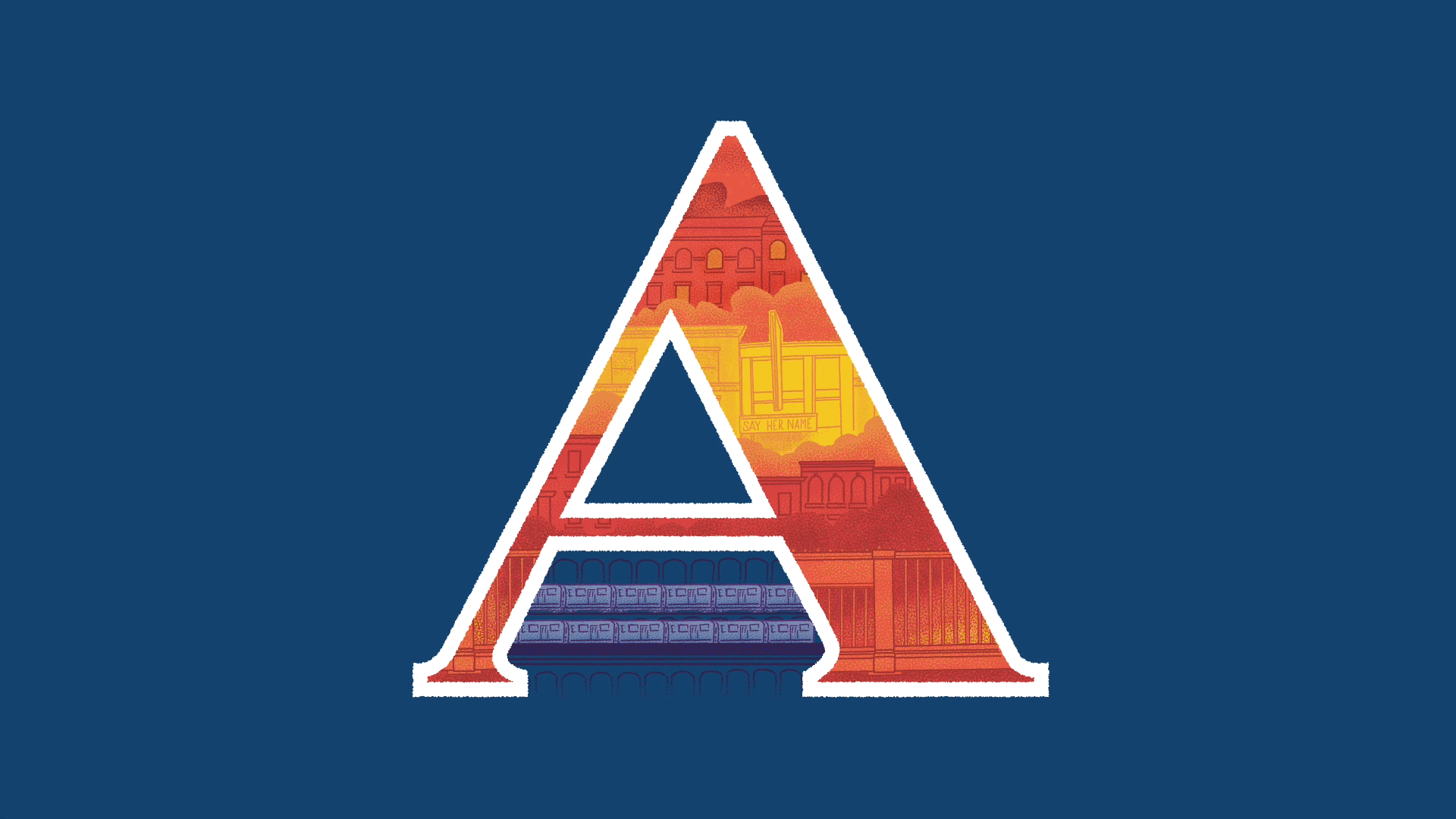
In the bustling metropolis of New York city, where one of the oldest and most-used subway systems weaves through different neighbourhoods, the local director Mary Hawkins takes on the journey of “visually spelling out” some of the subway’s lines. Crafting a collection of 23 hand-drawn and animated letters representing NYC’s subway routes, she introduces, as a result - Love Letters for the Subway.
Engaging in an insightful conversation with the visionary artist and director, we reveal the creative process behind her drawings, while highlighting the ensuing public conversations sparked during their creation. We also get the insight into sound composer Carlos Dengler and his contribution in enhancing the animated experience.
How did your journey into animation and design come to be?
Some of my earliest memories are about recognizing colours and going to museums with my family. And once I realised that people did things like making paintings and designing buildings, I only wanted to do that with my life. I fell backwards into motion graphics. Having a BFA in production design and a Master’s in 3D animation + VFX, I wanted to mash these two strands of thinking together, but there wasn’t a convenient phrase for the thing I wanted to do until a few years into my career. When I started grad school, the tech was still so unwieldy and expensive that it was cheaper to get a degree versus buying a copy of Maya. It was a tough industry to get into and stay in long-term. It has been two decades and I only know a few other women who started with me and are still working as artists.
I love being an art director and having these motion skills because I can take a project from brief through to finishing and still get to be hands-on. My field is always evolving, growing and changing. There is a lot to keep up with, but I also get to learn all the time and try new things.
What was the inspiration behind using typography as the primary visual element in Love Letters for the Subway?
Love Letters started with the typography and morphed into a short film. It grew out of my final project for Martina Flor’s The Lettering Seminar, which was to do one hand-lettered word or phrase, and I intended to make something for #36DaysOfType, an online lettering challenge.
I wanted to make something that would have the potential for motion, and I landed on the idea for the Love Letters because it was modular – I could quit whenever I needed to and still succeeded in making something worthwhile. I never expected to make a short film! Between my freelance clients and my side hustle, I didn’t think I had all that much space in my schedule. If I had come in with the expectation that I had to finish a short, I don’t know that I would have started. It is the biggest personal project I have ever taken on, which took me over a year to complete.
When I was just getting started, I looked at how other illustrators and type designers handled the 36 Days of Type challenge. It is such a broad, open brief that it really attracts a lot of creative choices and methods. One of my mentors on this project is Ken Barber, the type design director at House Industries, and he went through my alphabet and helped me sharpen up some of the letterforms. I knew going into that session that a few of my letters were messy, but he also has such a depth of knowledge about building letters from scratch, so he saw things I wouldn’t have caught. There are a bunch of optical tricks that help balance letters top-to-bottom, side-to-side. I was going to do some sleight-of-hand to adjust the G into a question mark as it turned, and he convinced me that I could do a true ambigram with a minor tweak.
Because I had a year, the design solutions I started with aren’t always the ones I finished with. Seeing the changes over time was also satisfying as I got more confident with the project and made more interesting design decisions.
Tell us about the creative process behind typography-driven images. How did you decide on the fonts, layouts, and overall visual style?
There are no fonts! Everything is drawn from scratch, and I maximised the space I had in and around the letters for the rest of the illustration. I gathered references from just being around the city. I would take pictures of details on the trains, tiles in the station or letters on buildings while I was out and about.
I did a test letter H and it taught me what I did and didn’t want visually. It was really lovely, but it had this dreamy haze that felt more like faux Gotham than New York. I realised that I needed to give the project a sense of place. Even though I am using fantastical colours and absurd scale or a changed perspective, everything here is still rooted in how people get around our city.
I kept a deck where I would drop snippets of photos or written notes to myself as I had time to work on things. It’s the sort of boring paperwork you never want to put together for a project, but since I was bouncing around and might not get back to it for a month, I needed to be organised so I could pick up where I left off. I also have a bulletin board in my office that I would look at each morning with a mood board, sketches and plans.
I set a few explicit visual challenges for myself. One was that I didn’t want to use black and white – I saved white for the letters’ outlines. I started with a bright colour palette because the subway uses these iconic colours, and I did want to include that, even if I didn’t match my colours to theirs. From there, I needed to find a few more brights that would help me have a lot of different moods and flexibility, and as I drew more letters, the palette grew. It is easy to make cities grey, but that’s not my actual experience of being in NYC. Yeah, everything is made out of bricks and concrete, but we are submerged in visual cacophony daily. My experience as a New Yorker is that I am looking at other people, not the floor tiles.
Everything here is digital, but I used brushes that responded to my hand movements and had their own idiosyncrasies. So I had to learn how and when to control or not-control that. So much of my commercial work is slick, fast and shiny, and I use a lot of compositing tricks and collage techniques – even greenscreen and other VFX techniques are collage, in a way. I wanted to make an illustrated world that felt hand-drawn. That was a flavour of motion graphics that I don’t get to explore in my career very often.
“It is easy to make cities grey, but that’s not my actual experience of being in NYC. Yeah, everything is made out of bricks and concrete, but we are submerged in visual cacophony daily. My experience as a New Yorker is that I am looking at other people, not the floor tiles.”
The NY subway is one of the busiest transit systems in the world. How did you capture its unique characteristics through animation?
A lot of what I tried to capture wasn’t the hustle-bustle. These are love letters – I can take a rosy view instead of talking about pain points. For years, I would take the subway to clients’ offices in Midtown or Lower Manhattan, which are the busiest stations at the busiest times of day, so I was clumped up against strangers while also being worried about getting there on time. I wanted to skip all that.
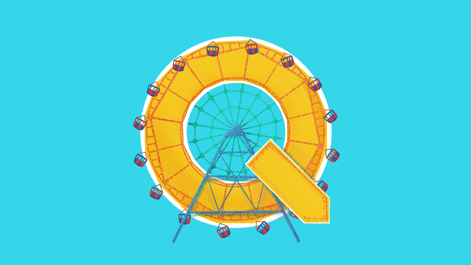
This project reflects the things I like about the subway – I can read or people-watch, and then there are moments where the city shows off for you, like when I am on the Q out to Coney Island, and suddenly I see the Wonder Wheel rise over all those apartment buildings. In American pop culture, we romanticise cars – how many movies are there about road trips? – but not a lot of love for how I actually get around. My experience of my city is more about being packed into a metal tube with the other folks who live here than about seeing the skyline glitter. I love our built environment, but I also love seeing how birds and plants adapt to being around all of us.
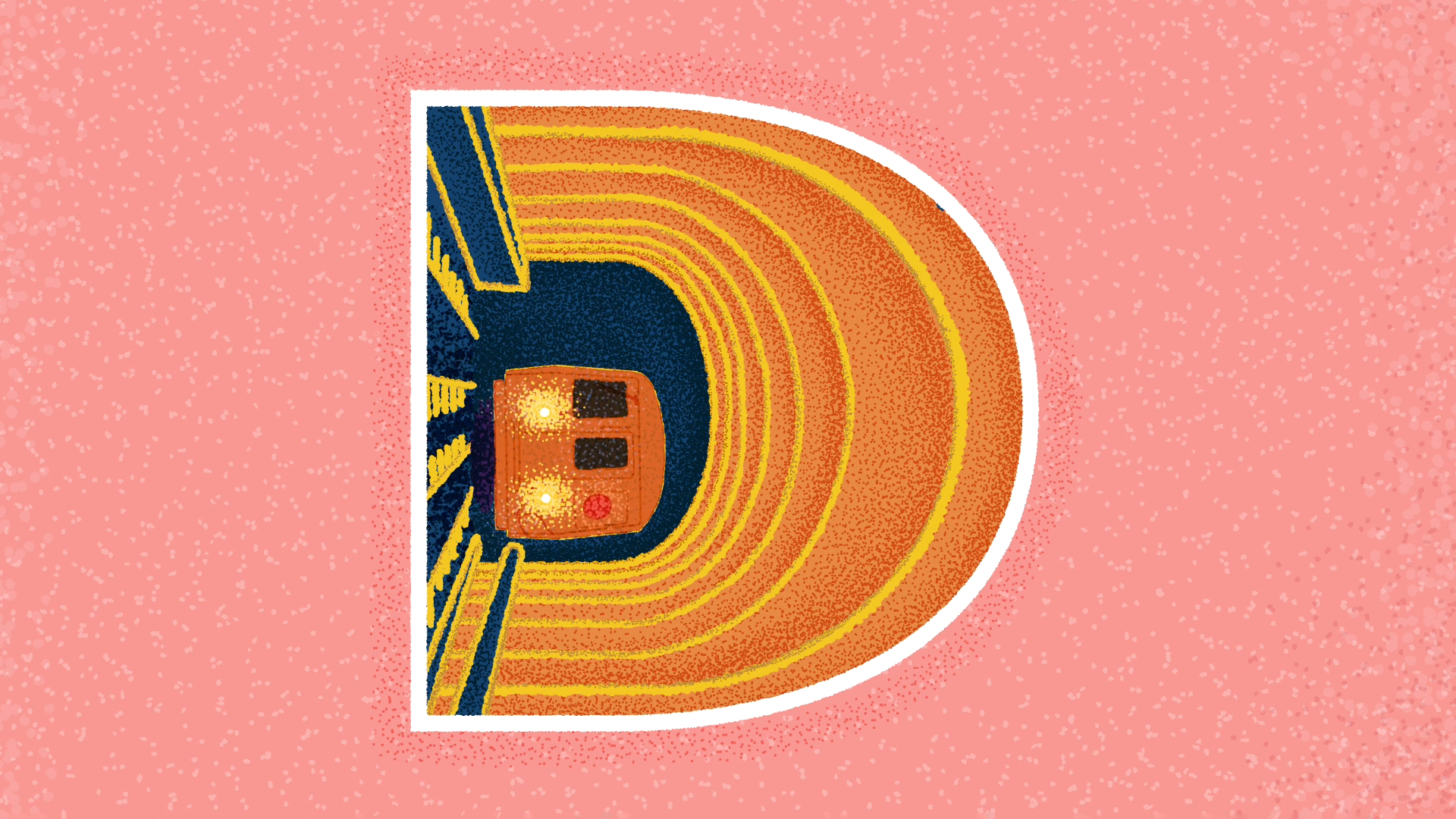
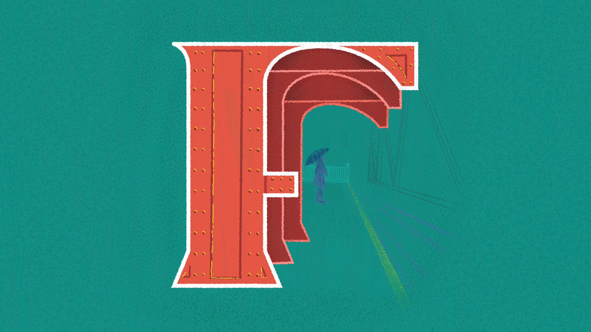
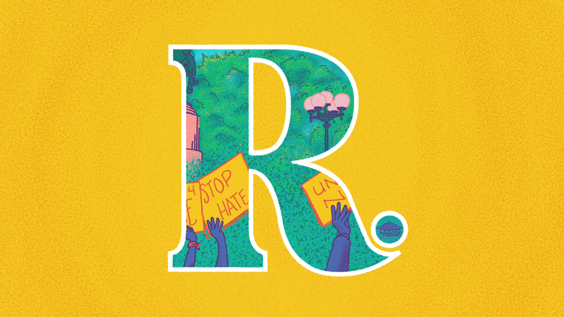
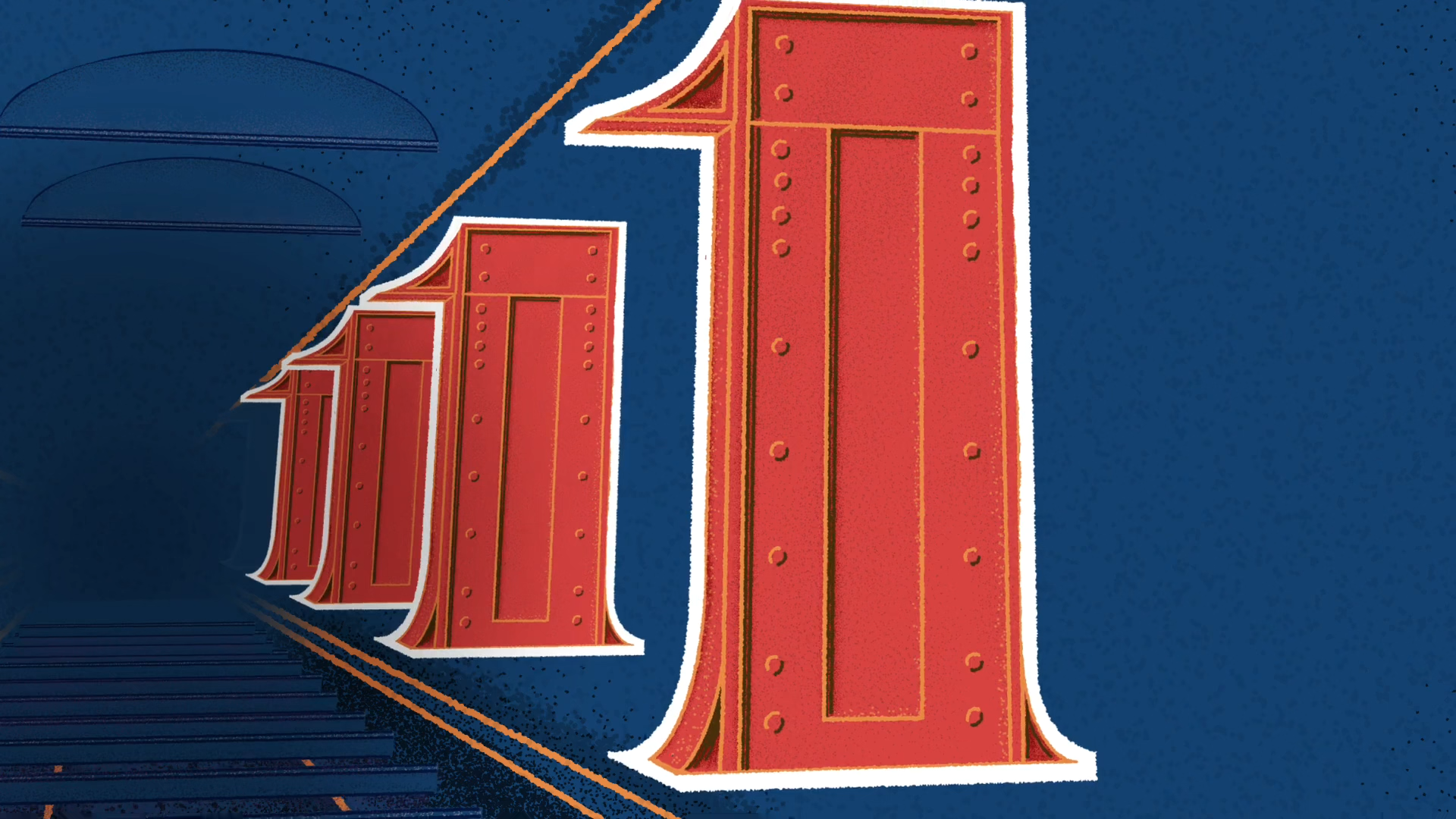
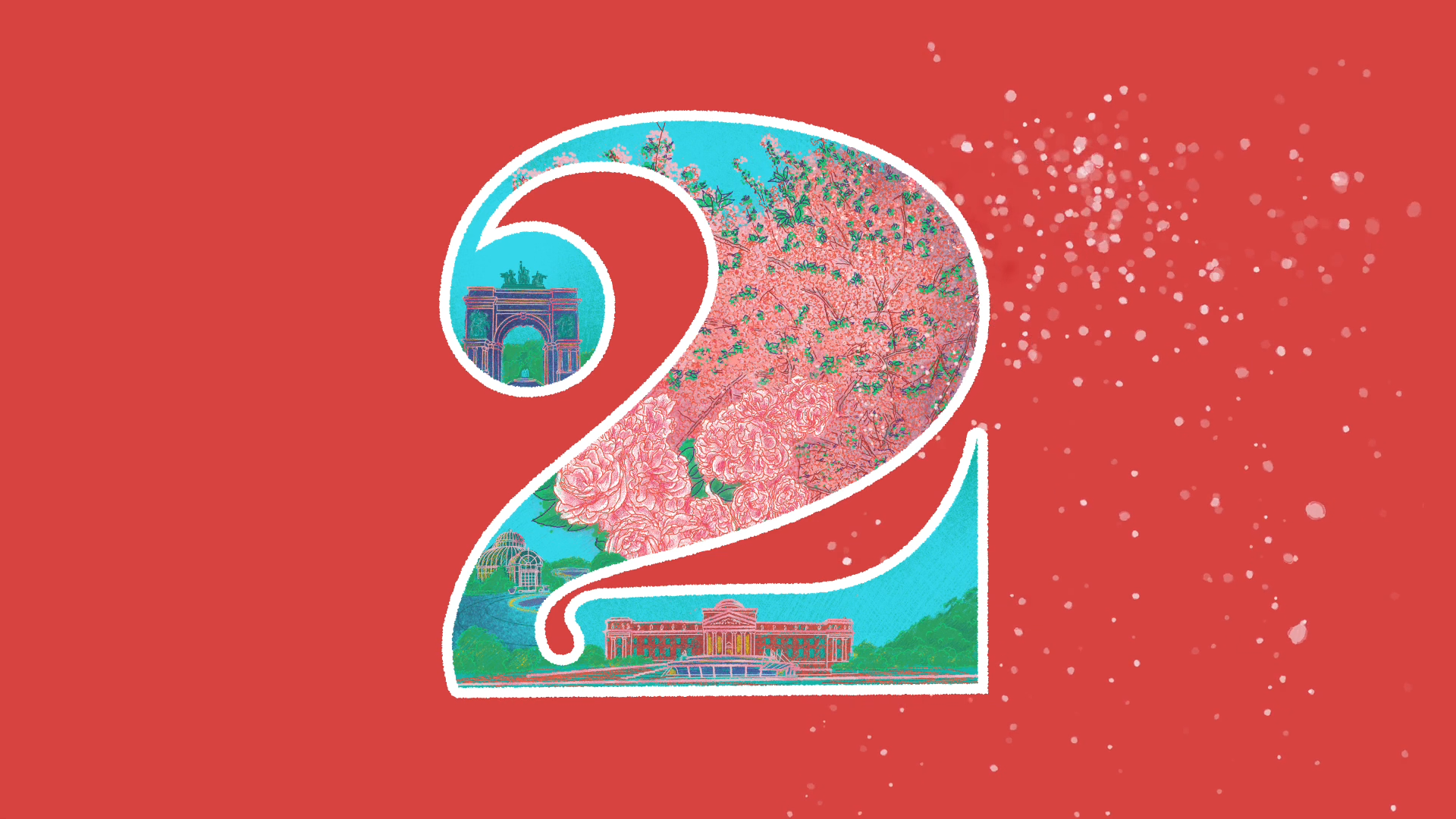
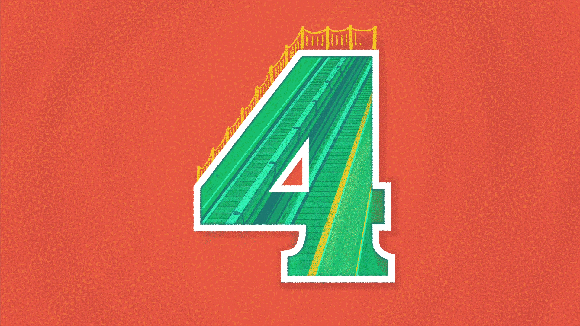
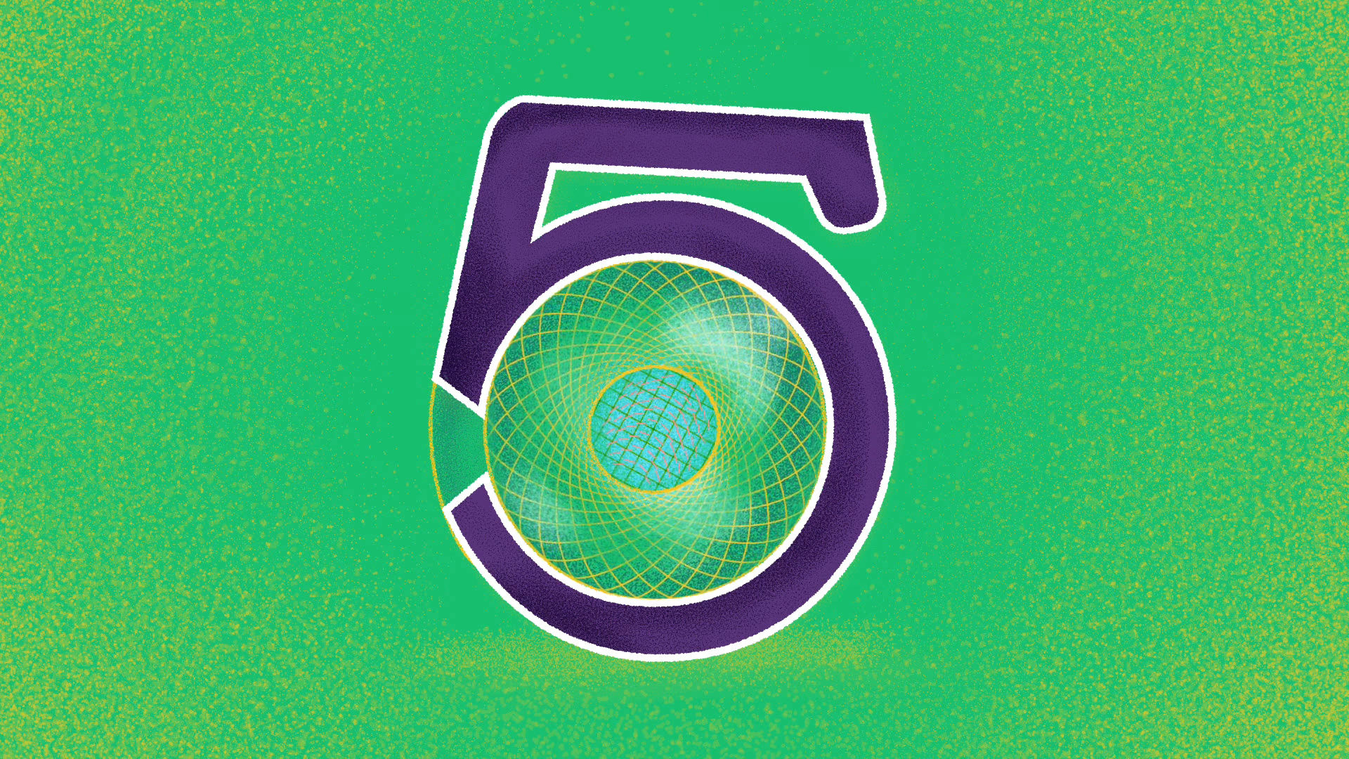
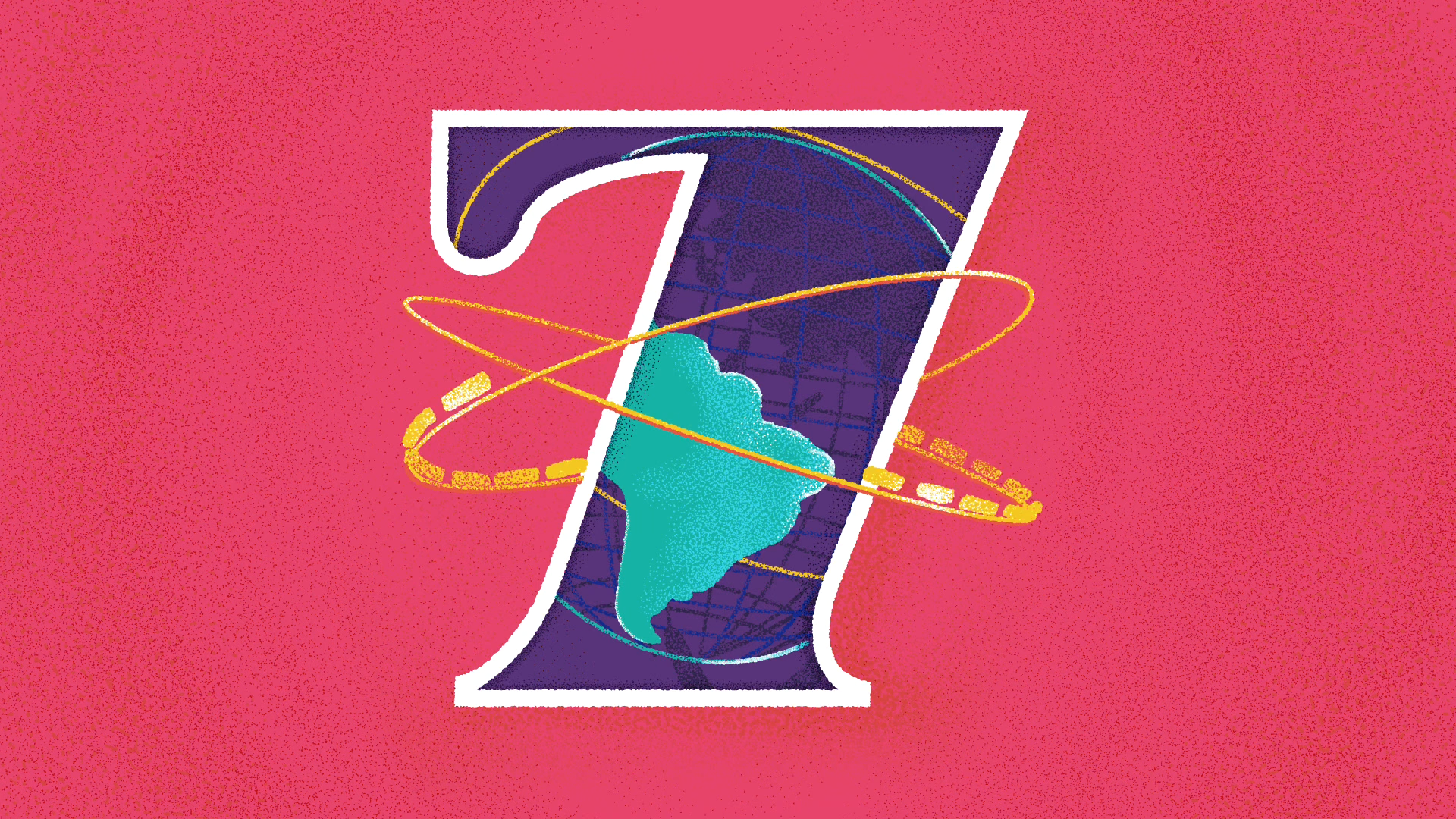
I tried to match each letter with something on that subway line that locals would want to go to. There are 23 parts to match the 23 subway lines, so I had space to stretch out and take on a lot of different responses. Some of these are more abstract and idea-driven, like the C and D trains and then some are about how people gather around the city, like the L or the R. The G is a local joke – no one knows where that train line goes. The 2 and the 3 feature landscapes and parks so they reflect how we experience the changing seasons here. A lot of them are about finding letters in architecture, like the Q and Z. The M and the 1 are about abstract movement that is there in every subway trip. I have pieces that are about the experience of using the outside/overhead elevated stations, like the F and N.
One of the challenges here is that the MTA has well-known branding they protect. They have a specific set of trademarks they list on their site, so I used their list as a springboard to find my own way into talking about the subway. I also wanted to avoid major landmarks – this is about New Yorkers’ relationships with our city, not the glitz or the tourist view.
Tell us about the audience's reaction to the film. How did you gauge its success? As a result of conversations held during the making process on the subways, what were the most interesting responses from the viewers?
I drew the entire film on my iPad and snuck in time to work on it while I was on the subway. New Yorkers try to give each other space, but people would watch me as I drew, and some people moved over to stand near me or take the empty seat next to me while I worked. Kids would talk to me and want to know what I was doing, but most people were content to watch. Animation is usually so solitary that it was a treat to have people be interested in what I was doing.
I spoke to a few people who wanted to tell me about their neighbourhood or favourite places in the city, and there were a few people who pointed me towards ideas and landmarks that helped me solidify the ideas behind some of the pieces. I would show the project to friends, and if there were other people around, I would welcome them in and ask them which trains they used around the city. For instance, I had no idea what to do for the 3 lines, and someone suggested I go to a couple of places along it, including Harlem Meer. People often have a love-hate relationship with their commute, so I thought it was a big compliment when a friend told me that she hated the F line but loved my take on it.
While people are watching it – and early on, I would just hand my phone to friends and watch their reactions – they’re often waiting for their train line and want to see what I picked to represent each line. Afterwards, they want to talk about their favourite places or tell me a story. Because my film is abstract and non-narrative, often people’s reactions are to tell me a story and start a conversation. Even when I have shown the piece at design conferences, designers want to talk to me about their neighbourhood, and non-New Yorkers talk to me about where they live or grew up. I love getting that reaction from people.
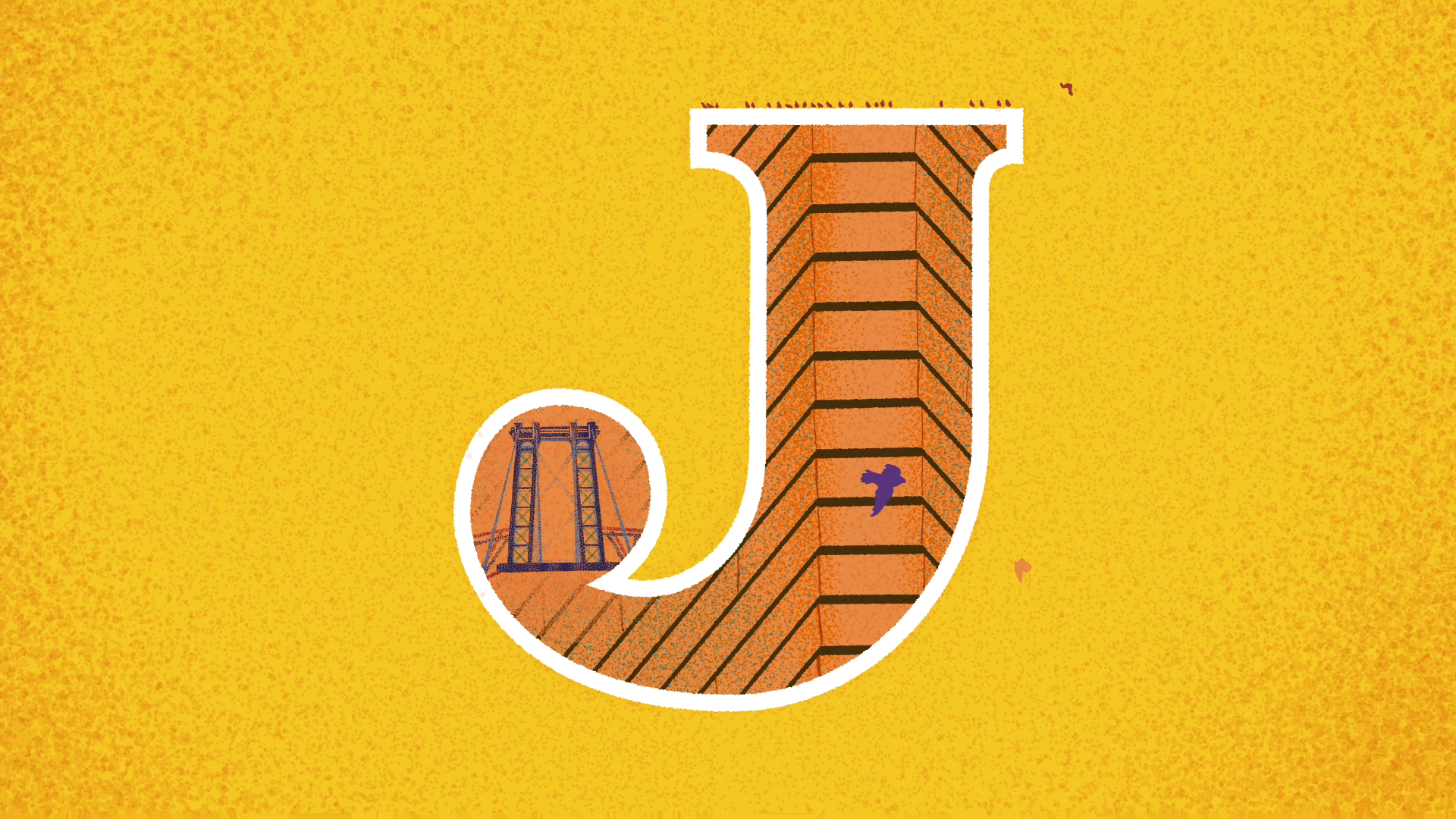
It is interesting to me that I made a piece about being local meant for other locals, but since NYC is such a global city and a dream city with such a presence in pop culture, non-locals seem to connect it back to places they love. I showed an early version to a friend of mine in Belgium for feedback. His favourite letter was the J, and he and I started talking about the birds that gather around this one bridge in his neighbourhood. People from outside NYC will tell me about the landmarks they grew up around or how they get around where they live. Love Letters was featured at a design conference this June, where I met designer Muk Monsalve, who had done a project romanticising the typography on the bus system in Buenos Aires.
What was the role of sound design in the animation film? How did you collaborate with Carlos Dengler to create an immersive and complementary audio-visual experience?
Carlos and I met in college, and when I first met up with him again, post-pandemic, I was drawing the letter W while I waited for him. I had never thought about adding a soundtrack, but he was enthusiastic about working on it, collaborating on original music and doing projects together if anything came up. It was a really cool offer, but I didn’t know if I knew enough about music to benefit from working with a composer at his level of talent. I gave myself a gift: I told myself that whatever the dumbest thing I was going to say about music to Carlos was, I’d already said it twenty years before.
Before our first conversation, he sent me a link to some of his unpublished work, and I wandered around the city listening to those tracks on loop. I picked out a piece that resonated with me, and then we talked about what I was hearing and reacting to in his work. One of my goals was to use his soundtrack for contrast with my visuals since my project was full of those bright, poppy colours, and I didn’t want something that turned them into bubble gum. I knew he had a really broad range of music he had composed and styles that he had worked in over the years
We had to be strategic since he is always busy, and like me, he was fitting these in around his main projects. When I heard the first draft of the main soundtrack, it felt like such a gift. We had been using a song I thought I liked, but when we put the two halves together – original music just fits differently. I had been working on my project for months and watching the same animation over and over to perfect it, and seeing it with his soundtrack for the first time felt like I was seeing new work.
Later on, he had a week between projects to fit in the 23 mini-scores for the loops, so we had to be strategic. He wrote a few tracks that I listened to while watching different letter loops, and we paired them up and thought about how to work on the ones that weren’t an easy match. The 2 and 3 are so much quieter, visually, so we decided to try a more ambient soundtrack for those two that matches more of his new-age work. Mostly, though, he experimented and tried new approaches, just like I was doing for the loops.
Carlos: Mary had never worked with a sound artist before, but she was nonetheless able to provide guidance about the overall sound aesthetic of the project. In her animations, the colours are bright, and the lines are bold, and this led me to some early ideas that we needed to dial back. As we tried different things out, a lot of the textures started coming back with a much darker hue than I would’ve thought possible. I think the entire project, as a whole, is now a balanced mix of light and dark, and a lot of the reason for that was Mary’s guidance. The sound design aims to speak to the best and the worst of the NYC subway. Some pieces celebrate this experience that brings together so many New Yorkers of disparate lives and backgrounds, while others seem to paint a more complicated portrait. The 6 Line is a miniature gothic mystery novel, while the L Line is an affectionate rendition of commuter monotony. Mary and I made sure that all of these messages in her visuals were supported or extrapolated in the sound design.
One important element of the sound design was the mechanisation of all sound sequences. Almost all have a kick drum metronome anchoring the ‘beat.’ I feel that the synthetic nature of the sound, using tons of samples and vintage keyboard emulations as I did, helps everything congeal along the lines of the locomotion that is an indelible feature of riding the subway, the constant screech and the constant onrush of trains.
How do you ensure your motion graphics work stands out and creates a unique and memorable experience for viewers? What do you focus on the most while creating your projects?
In my work, I am usually trying to tell a story and evoke big emotions in abstract ways, and honestly, on my end, that process looks like a lot of questioning and working through different outcomes to see what works and what looks new and fresh. I have a specific take, stylistically, but I also have a really open range of what I work on. I am lucky because the clients who picked me as an art director have already seen my work and style. We start at a place I want to be – we want something visually bold where the typography is the key.
Even though everything I work on is digital, I still start by thinking with a pencil. I draw mini-storyboards and rough ideas out on scrap paper and then jump in. When I get stuck, I turn back to pencil and paper and doodle. I rarely get to do intense illustrations as I did for this project, but I often doodle and sketch. Then the challenge is bringing that same life in those sketches into keyframes and bezier curves. Sketches can be open-ended and loose, but I work in a medium where it’s easy to erase or intentionally leave out the human touch. I am always trying to find ways to add those details back since it makes your work more specific and real; you’re adding back in connection.
What are you working on next?
I am working on some fun client and personal projects. But my next big things to come out are three movies I worked on: Kokomo City (Titles. Dir: D. Smith. Magnolia Pictures), Once Within a Time (VFX Artist. Dir: Godfrey Reggio) and Igniting the Spark (Art Direction. Dirs: Kelley Slagle, Brian Stillman). Carlos released his next album, Private Earth, earlier this month. We co–directed a music video for its first single, Golden Dawn, that uses his landscape photography in abstract ways.
Director: Mary Hawkins
Composer: Carlos Dengler